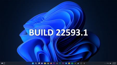
The latest beta build of Windows 11 which is this one 22593.1 is out and I have been pushing some buttons. Here are all the new bits.
Groove Music Player is dead
RIP to the Groove music player. Say hello to the Media Player. What it does is it curates your audio and video library and puts it all in one place.
You can still do your playlists… yes I have 15 playlists and counting… but some features have been either moved around or eliminated so for example in the music portion you no longer have the now playing list. The full list is now the ‘now playing’ list. Spotify integration button is no more and same goes for the graphic equalizer for those of you that used it.
Microsoft’s streaming service
Movies & TV still exists but now it is more dominated by streaming content with a single tab dedicated to the local library. I wonder who is renting or buying stuff here and not on Netflix or Amazon Prime or Disney+. It still sucks that Microsoft is strict about payment methods matching the location of the device using their services. Some of us in Africa rely on the diaspora to pay for our entertainment. Cut us some slack.
Weather & News widget
The weather widget is back and if your icons are center aligned it’s gonna be at the far left. Hovering over it will launch the widgets panel with even more stuff. Stocks, Football updates, stock market charts and news. And yes you can customize the panel by adding or removing widgets. Some of them can be resized as well to your preference.
QR scanner in the camera
The camera now supports QR code scanning and I secretly love this one because my biggest use case for it will be scanning a wifi login QR code rather than typing the password. I am lazy like that.https://www.youtube.com/embed/8TH0gVVqP5Q?version=3&rel=1&showsearch=0&showinfo=1&iv_load_policy=1&fs=1&hl=en-US&autohide=2&wmode=transparent
New charging icon
On the battery icon you used to see a plug looking thing when a laptop is plugged in. Now that’s been changed to a lightning bolt. I mean I definitely prefer a lightning bolt as a symbol of power rather than a plug. It reminds me of Zeus, yes, but it’s also the universal charging conotation on a lot of other portable devices it only made sense that it be used here as well.
Relocated volume and brightness animations
The volume and screen brightness animations have been moved from the top left corner of the screen down to the bottom center. I actually missed it the first time I was adjusting the screen brightness and had a hard time trying to think if it’s a bug or a feature.
Peek into folders
In the file explorer, folders with media now show a snippet of the media in the folder to sort of make it easier to browse through them without really needing to open them. A cool one would be like a short 3 sec scrub of the media in a folder when you hover the cursor over it. Just a thought.
Dark mode task manager & enhanced Focus Assist
Oh and guess what! The task manager now supports dark mode and it looks rather good on my monitor. It’s probably something that will excite us nerds but I am happy it’s there now. And focus assist mode has added a bunch more features like how long you want it to last and what features or services you want to allow to disturb you when focus mode is running. You know. To get you focused.
These are some bits I found interesting in the Beta. if you have any you have seen as well you can always post them in the comments.-techzim

